Brand Fonts and Typography
Metropolia’s typography is based on the controlled use of three font families.
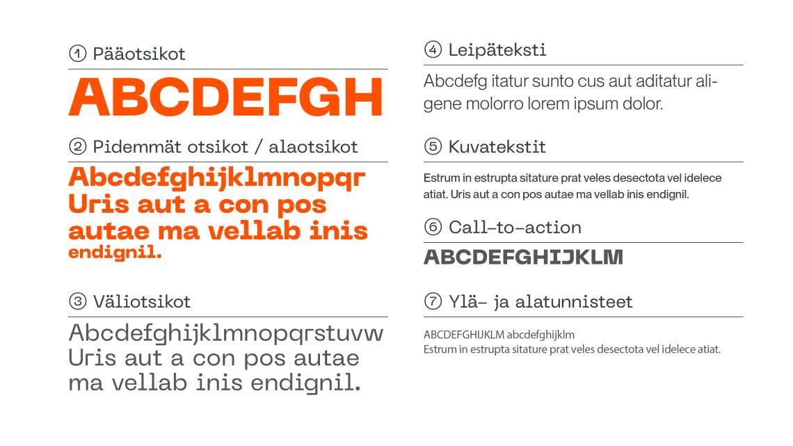
1–5 words
- Font: PP Neue Machina Plain | Uppercase
- Weight: Ultrabold
- Line height: 90% of font size
- Letter spacing: 10 (Metrics)
- Hyphenation: None
5–12 words
- Font: PP Neue Machina Plain
- Weight: Ultrabold
- Line height: 100% of font size
- Letter spacing: -10 (Metrics)
- Hyphenation: None
5–12 words
- Font: PP Neue Machina Plain
- Weight: Plain Regular
- Line height: 100% of font size
- Letter spacing: -10 (Metrics)
- Hyphenation: None
Long Text Passages
- Font: PP Neue Montreal
- Weight: Book
- Line height: 120% of font size
- Letter spacing: 0 (Metrics)
- Hyphenation: Yes
Long Text Passages (Captions)
- Font: PP Neue Montreal
- Weight: Medium
- Line height: 100% of font size
- Letter spacing: 0 (Metrics)
- Hyphenation: Yes
Buttons and Highlight Text
- Font: PP Neue Machina Plain | Uppercase
- Weight: Ultrabold
- Line height: 90% of font size
- Letter spacing: 10 (Metrics)
- Hyphenation: None
- Font: PP Neue Montreal Mono
- Weight: Medium
- Line height: 100% of font size
- Letter spacing: -20 (Metrics)
- Hyphenation: None
Typography
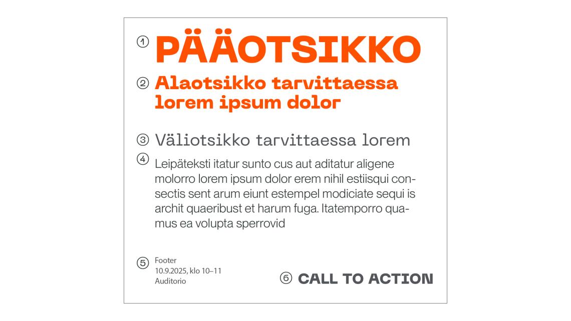
Fonts should be used according to the guidelines provided.
The primary headline size guides the sizing of other typographic elements: aim to make primary headlines as large as possible. Body text size should be determined based on the length and scope of the content. Percentages indicate the relative size of different text levels in relation to each other.
Keep headlines short and concise – use a subheading if needed.
Do not write sentences in ALL CAPS, as this creates a shouting effect.
- Font: PP Neue Machina Plain Ultrabold
- Example Size: 90 / 85 pt
- Font: PP Neue Machina Plain Ultrabold
- Example Size: 45 / 45 pt
- Font: PP Neue Machina Plain Regular
- Example Size: 40 / 40 pt
- Font: PP Neue Montreal Book
- Example Size: 30 / 35 pt
- Font:PP Neue Montreal Mono Medium
- Example size: 20 / 25 pt
- Font: PP Neue Machina Plain Ultrabold
- Example size: 35 / 35 pt
Brand font licensing and use
Metropolia Communications manages the licenses for the brand fonts. Brand materials are produced either by the Communications Services or by approved partners who have the right to use the fonts.
Font licenses allow the use of the fonts in both print and digital materials, as well as the PP Neue Machina Plain headline font on the metropolia.fi website.
Substitute free fonts
For general use, we provide templates created with Google’s free fonts, such as info and poster templates. The substitute fonts are visually similar to the brand fonts.
Headline font in general templates:
Body text font in general templates:
Fonts for Office software use
In PowerPoint and document templates, we use the Arial font.
Questions About Usage of Fonts or Typography?
Contact Metropolia Communications at: marketing [at] metropolia.fi (marketing[at]metropolia[dot]fi)


